Gun Rights: Part 7 - Proof by Chart: Will Reasonable Gun Control Save Lives?

Are Background Checks Working
- ONLY 0.5% of background-checks end up as a denial, but that represents over 1.2 million potential criminals not getting guns. Why does NRA want to stop/limit this and, in a backhanded way, of supporting terrorism? http://money.cnn.com/2015/12/06/news/fbi-gun-background-checks/index.html?iid=hp-stack-dom
- Just THINK about how many more criminals will find it harder or impossible to get guns if Background Checks were expanded!
THE PREVIOUS SIX PARTS DEVELOPED THE CASE FOR SANE GUN REGULATION via statistical analysis. Now, I want to accomplish the same thing more holistically by presenting various charts that graphically support my previous conclusion that better, sensible gun regulations will reduce the 80+ gun deaths a day.
There is a tiny amount of statistics to show the strength of relationships between the various charts which you will be thinking about. It's called the Pearson Correlation Coefficient which gages how much each chart looks or doesn't look like the other. The numbers you see will be between 1 and minus 1 with 0 meaning "no relationship at all". I will break the news here, there is a strong Negative correlation between the rate of death in America, no matter which way you measure it, and the strength of gun regulation when compared on a state-by-state basis.
What that means to you is that, as a rule, states with better gun regulations have lower rates of deaths. Further, that relationship is moderately strong (right below very strong). The way this is determined is by putting each state into one of six boxes which reflect a certain range of gun regulation scores or rates of death. A perfect negative correlation would be when a state has a regulation rank of 1 it will have a death rate ranking of 6. A state with a regulation rating of 2, then the death ranking of 5; and so on. If that were true for each state, then the Pearson Correlation Coefficient (PCC) of '- 1'. Clearly, reality isn't perfect but in considering a population of 50 states, a PCC that is greater than +/- 0.28, then there is good evidence that a real relationship exists; the lowest PCC you will see below is -0.50.
That is it with the statistics. (your welcome).
In The Beginning ...
... THEN THEIR WERE GUNS, THEN THERE WAS ABUSE OF GUNS, and THEN THERE ARE GUN CONTROL LAWS to help curb the abuse of guns. Since my whole premise, and what I think I proved in the last six Parts, is that sensible gun regulations save lives. They do and it is demonstrably so. So, let's let my first chart, Chart 1, be that of how strong and weak gun laws are distributed around America.
My source is https://www.opensocietyfoundations.org/sites/default/files/GunReport.pdf. It ranks states, after an exhaustive study of their laws, on a scale from -10 (Maine, of all places) to 76 (Massachusetts, unsurprisingly). I then group into six buckets and produced Chart 1 from the result.
A Pictoral Look at Gun Regulations in America

WHAT DO YOU SEE? A lot of states with piss extremely poor gun control (some who even ignore the few federals that still exist), 26 that you see plus Alaska ... all of the white ones. Two states rate the highest (most effective regulations), Hawaii, which you don't see, and Massachusetts. That accounts for 29 of the 50 states. The remaining 21 are split between the four other buckets where 11 have the second lowest rating, 6 are in the third, 2 in the fourth, and 3 in the next to highest.
I suspect there are many surprises for you on this map. Who would have thought states like Oregon, Maine, and New Hampshire would have poor regulations; and states like North Carolina and South Carolina would have reasonable gun control; I sure didn't until I did the research for the first six Parts of this series.
The first comparison I would like to start with is with which states have the lowest and highest rates of gun ownership; that would be Chart 2. Charts 3 through 5 expand on this view.
Next we are going to look at different configurations of death as a result of all reasons not natural and any mechanism of dying; homicides and suicides with and without firearms. When you begin looking between Chart 1 and Chart 2, keep in mind that while with Chart 1, the darker colors mean BETTER regulations, in Chart 2 on, the darker colors represent HIGHER rates of death.


Gun Regulation vs Rate of Gun Ownership
Chart 2 is simply Chart 1 with the states with the poorest firearm regulations where the bottom 2 levels have been outlined in red for better reference later on
Chart 3, on the other hand, is a map of states which are color coded to identify the prevalence of gun ownership, the darker the color, the higher the rate of ownership.
Chart 4 is Chart 3 with those states with the 2 highest rates of ownership outlined in green.
Chart 5 is the interesting chart. First, in order to present the starkest contrast, I colored the states with the 3 highest levels of firearm ownership in black (the remainder in light blue have the 3 lowest levels of ownership) and added the red outline which comes from Chart 2, which is the map of gun regulations. What we are looking for at this point is how well (or not) the states in black fall within the red border. The more they line up, the stronger the relationship between gun regulations and gun ownership.
As verification, I ran a statistic called the Pearson Correlation which measures the relationship, or lack thereof, between two sets of variables. The value of -0.73 you see on Chart 5 means a fairly strong correlation and the minus sign means it is an inverse relationship, i.e., weaker regulations = higher ownership. But, more on this statistic shortly.
But, what the take-away is that such a relationship exists, contrary to popular believe by gun rights advocates. It also backs up the findings in http://hubpages.com/politics/More-Guns-More-Violent-Crime-and-More-Homicides-by-Gun-It-Is-As-Simple-As-That-Part-4-2041
With that as a preamble now let's turn to that nasty statistic called the Pearson Correlation.
Examples For the Pearson Correlation Coefficient Statistic
BASELINE SERIES
| SERIES 1 (P = 1.0)
| SERIES 2 (P = -1.0)
|
|---|---|---|
1
| 1
| 10
|
2
| 2
| 9
|
3
| 3
| 8
|
4
| 4
| 7
|
5
| 5
| 6
|
6
| 6
| 5
|
7
| 7
| 4
|
8
| 8
| 3
|
9
| 9
| 2
|
10
| 10
| 1
|
SERIES OF NUMBERS TO BE USED IN SHOWING WHY THE PEARSON CORRELATION COEFFICIENT IS A NEAT STATISTIC TO SHOW RELATIONSHIPS - TABLE 1
Pearson Correlation Coeffiient
IT ACTUALLY HAS A LONGER NAME THAN THAT but it will do for space purposes. I bring this up because as we work through these charts, it would be nice to have a metric to help interpret what you are seeing, and the Pearson provides a nice simple metric to do that.
To show you how this works, look at Table 1. It contains four columns of numbers with the first column being our reference variable to which we compare the others. As you can see, it is a simple series, ten numbers 1 through 10, in order. Column 2 is the same set as the first and in the same order. Column 3 reverses the order and Column 4 is just a random set of numbers between 1 and 10. Why all these numbers? Because they represent the numbers used to make the charts you see below, the colors you see on the map, in other words.
So, with that let me tell you that the Pearson Coefficient runs from -1.0 to 1.0; where -1.0 and 1 are perfect correlations, just in opposite directions. A zero coefficient means no correlation at all, just randomness. OK, look at Column 2, that matches Column 1 perfect, therefore the Pearson Coefficient is 1.0. Column 3 is the inverse of Column 1 and therefore the Pearson is -1.0. Column 4 is just a random set of numbers relative Column 1 and as a consequence, the Pearson is almost zero.
When considering the information below, use the above to help judge the various relationships I will offer next.
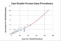
Where Do People Die From Gunshots In America
ABOUT 268,000 PEOPLE A YEAR DIE from injury (2012); 33,000 (12%) of them from firearms. While one not would expect there to be little relationship between the distribution of those deaths, the distribution of gun ownership rates, and type of gun regulations. But there seems to be, which leaves me wondering why.
Chart 6 is a map of how deaths from injury are spread, state-by-state, across the U.S.. The color code is such that the darker brown, the higher the death rate. I'll provide some thoughts on that later in this Hub. But first, let me introduce the next set of charts we will using in analyzing homicide rates.
Chart 7 reproduces Chart 2 outlining the states with the poorest gun regulations for easier comparison.
Chart 8 puts a boundary around the states which are in the two lower buckets of death rate.
Chart 9 adds the outline from Chart 7 so that the reader can get an idea of how much, or how little they correspond.
Where Deaths Happen in America
Click thumbnail to view full-size


WHEN COMPARING Chart 2 (weak gun regulations) with the others, what you are looking for, if you believe in my hypothesis, are areas where its Dark in one chart and Light in the other. Those opposing colors mean that where gun regulations are good, death rates are lower and where guns control is poorer, death rates are higher. If you think the opposite is true, then you want the colors to match as much as possible between Chart 2 and the other you are looking at.
Take a quick look at Chart 6 and get a feel how general death rates are distributed and then click to a more informative chart, Chart 7, where the deadliest states are outlined in green or have a blue dot in it.. Finally, glance at Chart 8 to refresh your memory of which states have weak gun laws.
With the next chart, Chart 9, we begin our analysis. Using the same ideas all ready developed by considering how many states with high death rates fall within the set of states with the weakest gun regulations. By observation you can see they line up pretty well. I created Chart 10 to put this in stark relief by coloring the states in the top 50% black.
You can count as well as I can and come up with the fact that a disproportionate number of states with high death rates fall within the group of states with the weakest gun regulations. Further, very few high death states fall in states with reasonable regulations. In addition, this level of apparent correlation is backed up with a relatively high Pearson Coefficient of negative 0.64. Again, I will get into my thoughts on the whys and wherefores of this result a little later on.
But first, let's drill down a bit and consider deaths where the intent was homicide, regardless of means.
Demographic Survey #1
Are You
How Randomness Looks
NOW THAT I HAVE OFFERED ONE SET OF CHARTS where there appears to be a good correlation between variables (gun regs vs. all unnatural deaths), let me present a set of charts where the relationship is near random, i.e., Pearson Coefficient near zero. Below is a similar set of charts to those you just saw. The difference it that I made the dispersion of rates of death random amongst the states.
Random Dispersion of Death Rates Among the States
Click thumbnail to view full-size


For comparison, the first chart, Chart 10, reproduces the chart with how gun regulations are dispersed among the states; the states enclosed in red are the worst two buckets.
Again for comparison, the second chart, Chart 11, presents how rates of death due to Firearms is spread across the US; that is real data. Unreal is Chart 12 where I used a random number generator to place each state in one of the six "rate of death by firearm" buckets. Notice the lack of similarity between Charts 11 and 12.
In Chart 13, I simply highlighted in green the states in the two highest buckets ... ones with the highest rates of death. Chart 14 takes those states inside the green outline and colors them black to make them stand out. I also overlaid the red outline (gun regs) from Chart 10.
That brings us to the meat of the project - how well do the black states (high rates of firearm deaths) line up with the red outline (weak gun laws). As you can see, the Pearson correlation correctly gives a result of -0.01; meaning no correlation at all and this is what you would expect from randomized data.
Why is this so? Because, given there are 17 black states, simply due to chance, 9 or 10 (56%) of them ought to end up inside the red outline, given that line surrounds slightly more than 54% of the contiguous United States. That result is a random result. And how many high death rate black states are surrounded by weak gun law red line states do we have ... lo and behold, we have 9! And that is why the coefficient is so small.
The last chart, Chart 15, shows what a "perfect" correlation, 1 or -1,would look like. As you can see, there are 26 black-colored states that fill in every possible state within the "weak gun law" red boundary. This, of course, will probably never happen, but between Charts 14 (no correlation) and 15 (perfect correlation), you should be able to gauge the degree of "sameness" between weakly regulated states, as it pertains to firearms, and rates of death for various reasons.
Our First Look At the Role of Homicides
WHERE I WOULD HAVE EXPECTED A MUCH lower agreement between gun regulations and all deaths from injury, that is not what we found. Instead, there was quite a bit of correlation. I haven't looked into WHY this is so, but just accept it as true for the moment, I did, however, expect a fairly strong correlation between gun control and all deaths due to guns being the mechanism or of homicides in general.
I was surprised again when I prepared the charts below for all deaths from homicide. I had expected a better correlation with Homicides vs Gun Regulations than I did with rates of death in general. As you will see, the opposite seems to have happened.
First, let's look at the charts below and then I will explain what you see.
Where Deaths by Homicide in America Are
Click thumbnail to view full-size


SO. WHAT IS DIFFERENT BETWEEN CHARTS 6 (All Intents) and 11 (Homicides)? At first blush, it seemed to me there was quite a bit when you consider that the upper tier of states appear to be rather devoid of states which have high homicide rates. Further, you will notice that both the Southwest and Southeast states seem to have an overabundance of high homicide states; I wasn't expecting that.
Chart 13 makes this very evident by outlining in green those states within the upper third of rates of death from homicide. When the red outline of weak regulation states is overlaid in Chart 14, and then changing the states to black in Chart 15, it becomes pretty apparent that the strength of the correlation between homicides and gun regulations is weaker, not stronger. This is born out by the Pearson Correlation of negative 0.52. (Remember, negative means a reverse relationship, one that means weaker regulations are correlated to more deaths.)
Unsurprisingly, this result IS statistically different than the negative 0.64 we obtained when looking at all deaths. But that is NOT saying there is no relationship, there certainly is, just not as strong. This actually agrees with my results from the statistical analyses in the previous parts to the series which found that, while close, the rate of gun ownership (as well as regulation strength) and the rate of homicides is not statistically significant enough (it was close, but no cigar) to say with some certainty that "more guns = more homicides".
Nevertheless, with a negative 0.52 correlation and with the sample size of 50, it is understood that the probability of this configuration (high homicide rates and poor regulations) of happening by chance is pretty low.
Better, however, is the relationship of Firearm deaths with gun regulations, as we shall see.
Death From Gunshot Injury vs Gun Regulations
AGAIN THE PATTERN CHANGES AS WE CONSIDER firearm deaths, regardless of intent (meaning suicides are considered as well). The charts below are similar to the ones you are familiar already. First we look at the distribution death from gunshots unadorned with other information. Then a reminder chart of which states have weak gun regulations followed by the high death rate states outlined in green. Finally, for contrast, I colored the top 50% of states with gunshot deaths in black and the remainder in another color.
Where Do Americans Die From Firearms
Click thumbnail to view full-size


Are Firearm Caused Deaths Related to Gun Regulations?
YES, AND MORE STRONGLY AS HOMICIDES or all deaths by injury. Where a Pearson score of -0.52 for Homicides is significantly different from negative 0.64 for all deaths, the Pearson score of negative 0.54 for Firearms is not.
What makes the relationship stronger, in this case, is the addition of high death rates states in the Northern tier of states where there are weak regulations. But still what is surprising is that given we are specifically considering firearm deaths as well as gun regulations, one would think the relationship to be very strong. But, just like we found in Part 2 of this series, the rate of gun ownership is only weakly correlated to homicides and robberies, but not the more general case of violent crime.
Now, that if we look at the narrowest case of homicides from guns vs gun regulation. Again, taking the lead from Part 2, the relationship while still obvious is nevertheless the weakest of those we will consider.
Where Homicide Deaths by Firearm in America Are
Click thumbnail to view full-size


WHEN YOU LIMIT THE MEANS OF HOMICIDE to Firearms, the patterns change very little in statistical terms from the case where the means of homicides is not necessarily a gun. Here the Pearson Correlation is a negative 0.50. While this value is little different from Homicides in general alone (-0.52), it is different enough so that we can no longer say that the pattern for homicides w/firearms and gun regulations is the same as the pattern with injury deaths and gun regulations.
When we change are focus to self-inflicted death, the story changes dramatically.
The Mentally Stressed Suffer Most from Presence of Guns
Click thumbnail to view full-size


How are Suicides and Gun Regulations Related?
VERY CLOSELY, AS IT TURNS OUT. BY INSPECTION, it should be very clear how closely total suicides are correlated with gun regulations; here total suicides increase as the regulation of firearms weakens. This is proved statistically in Part IV of the series. Further, it shouldn't be a surprise since death by firearm account for slightly more than 50% of all suicides, and the stronger the regulation, the less access mentally distressed people have to firearms. The next most popular way of doing oneself in is suffocation (which I assume includes hanging), accounting another 25%. As to the myth of substitutability, consider why people shoot themselves. One would think it is because 1) it is more certain, 2) it is quick, and 3) it doesn't hurt as much for very long; suffocating is a slow way to die and requires much more determination.
Now let me explain what I mean by "mentally stressed"; another synonym might be "emotionally troubled". Not only do I include those with with mental diseases also fall into this extremely broad group, I also want to expand it by adding in those that are temporarily not on an even-keel emotionally. Examples of this latter group might include someone who just lost a loved one, lost a job, suffering great physical pain, etc. Everyone in these situations are subject to irrational thinking, something many on the political Right believe is still normal behavior and therefore can't be used as a reason for gun deaths because the victim "chose" to kill themselves. And if this is true, then the availability of guns in a state should be a factor in rate of self-inflicted death.
In Parts 1 through 6, I developed the case that the strength of a state's gun control relates inversely with the rate of gun ownership. Also proved to be true is the rate of gun ownership is directly correlated to overall death by gun (doesn't "prove" cause, just strongly suggests it). All of that is supported by the graphical view where the Pearson Correlation is a very strong negative 0.67 between total suicides and gun regulations. Notice how many states with weak gun laws are colored black, meaning high rates of people taking their own lives. What drives this, of course, is, as pointed out above, over 50% of all suicides in America use firearms of some type coupled with the fact that firearms are more easily available and prevalent in those states within the red border.
When we consider our final configuration, self-inflicted death by gun, the correlation gets even more stunning.
Mental Disorders and Guns Don't Mix
Click thumbnail to view full-size


How About Suicide by Firearms and Gun Regulation?
IF THERE WAS A STRONG RELATION BETWEEN ALL SUICIDES and regulations, it is even stronger when you narrow the scope to suicide by firearm and gun control. The charts above are arranged as the previous ones, so after considering each, spend some time on the last one, Chart 37.
Now consider Chart 16 where present what a "perfect" negative correlation would look like. Almost identical, aren't they. That is why the Pearson Correlation is so high at negative 0.73! It doesn't take a rocket scientist without an agenda to recognize, just based on Chart 37, that IF the states with poor gun control, increased it to the level of states with good regulations, for example, California, then the loss of life through suicide can be reduced.
A summary table is offered below to enhance comparison between each combination of death and gun control.
... Vs Gun Control
| Pearson Coefficient Correlation
| |
|---|---|---|
All non-Disease Related Deaths
| - 0.64
| |
Homicide Related Deaths
| - 0 52
| |
Firearm Related Deaths
| - 0.54
| |
Homicide by Firearm Related Deaths
| - 0.50
| |
Self-Inflicted Deaths
| - 0.67
| |
Self-Inflicted Deaths by Firearm
| - 0.73
|
TABLE 1
TO GET A FEEL FOR THE DEGREE OF CORRELATION between each configuration of rates of death vs strength of gun regulation, consider that it takes a Pearson Correlation of +/- 0.28 or less (where the sample size is 50) before we can say with a high degree of certainty, that there is no relationship between the two variables. A quick review of Table 1 tells you that all of our cases are strongly related, in some cases, the instant Pearson Correlation is twice that of what would show no correlation.
Such a significant difference between the zero point and the values associated with each of our cases seals the deal, for me at least, that the above series of charts are 1) believable and 2) that there IS a strong relationship between gun regulations and various ways people die from non-disease related causes.
A Poll You Can Participate In
Do You Think That Gun Control Is Related to non-Disease Related Deaths, Especially Self-Inflicted Death?
Demographic Survey #2
Politically Speaking, Do You Most Often Identify With the ....
This content is accurate and true to the best of the author’s knowledge and is not meant to substitute for formal and individualized advice from a qualified professional.
© 2015 Scott Belford
Related

Gun Rights: Part 2: Violent Crime: Will Reasonable Gun Control Save Lives?

Balancing Gun Ownership and Public Safety: A Comprehensive Plan for Responsible Gun Reform

Finding the Correlation Coefficient Using Pearson Correlation and Spearman Rank Correlation
New Gun Laws and Gun Control for Gun Owners of America
Why Do We Own Guns?